

You’ve probably seen it — that gradient-heavy, vaguely purple aesthetic that screams “this was vibe coded.” As more folks build apps with AI assistance, there’s a default visual style that’s become almost unavoidable. I’m not a designer, and when I build things, I usually end up with whatever the AI generates first, which means I’m just as guilty of shipping purple slop.
So I tested Stitch, a beta tool from Google Labs that turns prompts (or images, or website URLs) into mobile or desktop UIs with exportable front-end code. The pitch: Generate multiple design variations so you can actually develop some design taste instead of accepting the first thing Claude or ChatGPT or Gemini gives you.
Testing with a startup metrics homepage
I had a web app I’d built (a learning platform for startup metrics definitions and calculations) that looked plain. I wanted something sleeker while preserving the dark and light mode I’d already implemented.
I gave Stitch the URL and asked for a sleeker homepage. The first iteration completely overhauled the colors — turning my blue hues into this army green scheme. It looked sleek, to be fair, but not what I was looking for. Stitch also misunderstood the purpose. It designed for a live metrics dashboard, not a learning platform where users explore definitions and sample calculations.
In this process, what I didn’t realize though was how much I cared about those blue hues until Stitch showed me the alternative. That’s the thing about visual iteration — you discover your preferences by comparison, not by trying to articulate them upfront. I wouldn’t have thought to say “preserve the blue” in my original prompt because I didn’t know it mattered until I saw the green.
I pushed back, asked it to preserve the blue from the original.
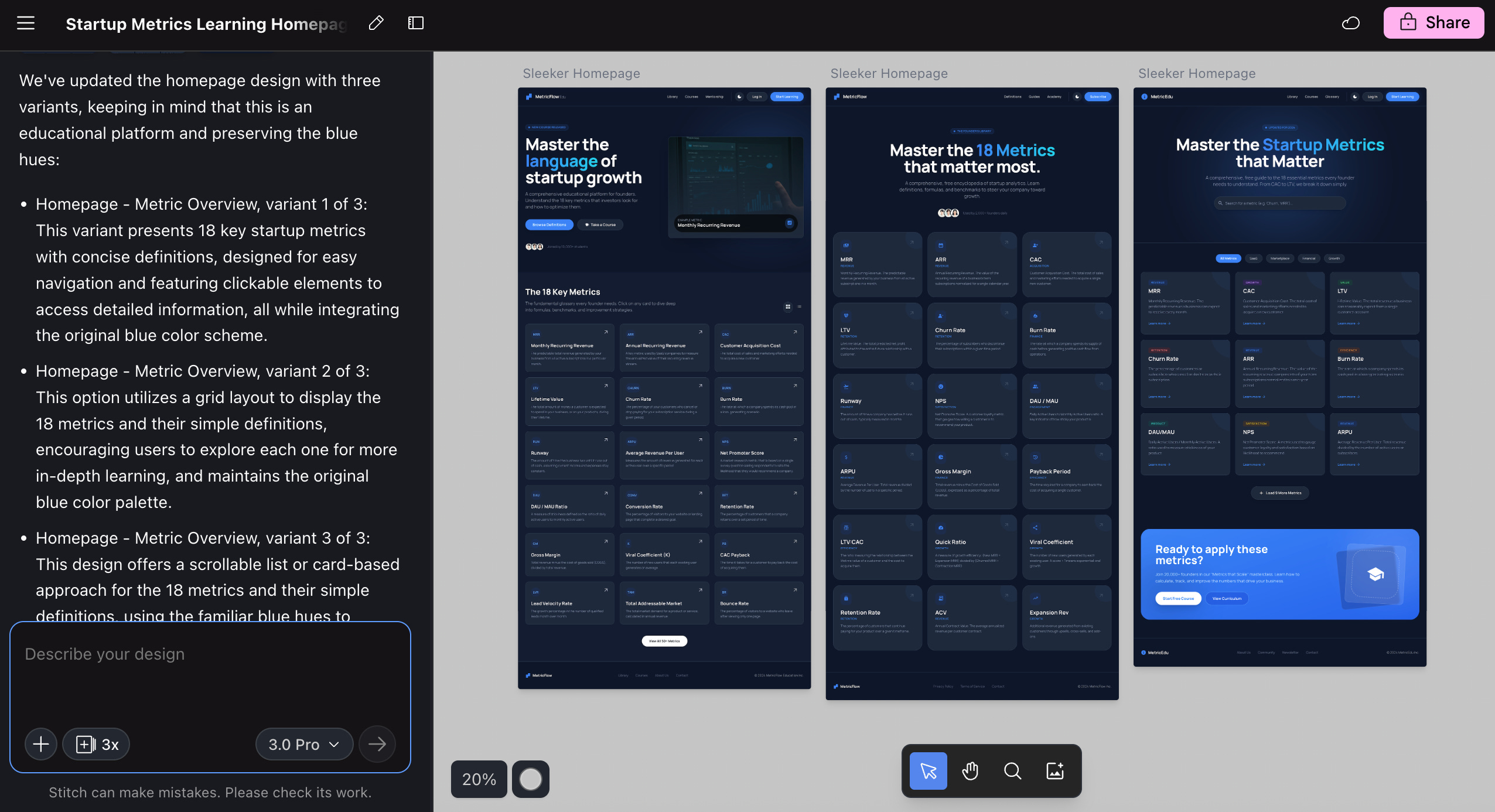
This time it gave me three variations that I actually liked. The final version of my web app now looks very close to the third option that Stitch generated.
Iterating on a language quiz app
The more interesting test was a Tagalog word matching quiz I’d been experimenting with. I’d already done a few rounds with Stitch, but I wanted to see what happened with the “YOLO” creative range setting. The other options are “Refine” and “Medium,” which were obviously the safer options. But where’s the fun in that?
I selected a base design, told it to generate five variations with a mix of light and dark modes, and let Stitch decide everything else — layout, color scheme, fonts, text content. The results were varied: three dark modes, two light modes, and one design that made me laugh out loud. This retro arcade game-like UI with a wild splash of colors felt so different from what I expected — the kind of creative leap I would never have manually prompted for. That’s exactly why the YOLO setting exists.
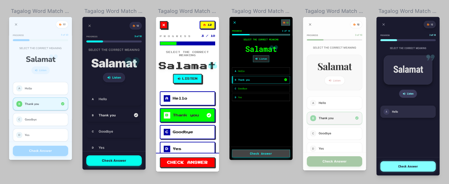
The variation controls are specific. You can tell Stitch to only change the layout, or just the color scheme, or just the fonts. If you already like your color palette but want to test different layouts, you can narrow the iteration that way.
What stood out (and what didn’t)
Stitch has a prototyping feature where you select multiple screens and it generates an interactive prototype. I created a simple flow: User selects an answer, clicks “Check Answer,” sees a “Correct” notification. The functionality worked, but the visual style didn’t match (colors were off). Close enough for testing, not ready for production.
The export options are practical: Copy code, download as zip, or — this is new and honestly exciting — send directly to Google AI Studio to continue building. That last option changes the workflow entirely. You can go from design iteration to actual app development without the friction of exporting and re-importing. If you’re in the Google ecosystem, that’s a seamless handoff from prototype to production.
To be clear, this tool doesn’t make you or me a designer. But it does something more valuable for non-designers: It trains your eye. Visual iteration works differently than text prompts. When you see five variations side-by-side, you start noticing things — that this layout feels more open, that color scheme feels more professional, that font makes it harder to read. You’re developing opinions you didn’t have before.
That first iteration with the army green scheme? I wouldn’t have requested it, but seeing it taught me that the blue hues mattered more than I’d realized. The retro arcade UI for the quiz app made me laugh, but it also clarified that I wanted something cleaner and more modern. Each “wrong” variation helped me articulate what “right” actually looked like.
I don’t think the real value is in the code export necessarily, even though it is convenient. In my case, I didn’t end up using Stitch’s code directly; rather, I rebuilt based on the designs I liked. What I’m taking away from this is that the value is in developing the capacity to have design preferences at all. I went from “I’ll take whatever the AI gives me first” to having strong opinions about layout, color, and typography. That’s not a small shift when you’re building things on your own.
Have you tried Stitch or similar design iteration tools? Did you find the variations helpful, or did they mostly confirm what you already knew you wanted? When building with AI, how are you developing taste beyond accepting the first output?


